All 5 parts are now online and can be found at the links below (this is much of a one stop place for me as anything else – I keep having to dig out the links!).
Month: March 2018
Developing Fluent Flowchart – A Retrospective
I recently released a new app to the Windows Store called Fluent Flowchart – a side project I’ve been working on since, my commit history tells me, late June 2017. It struck me it might be interesting to write up a short retrospective on the development process. So without further ado a bit of a warts and all look at development follows.
Motivations
I can’t remember exactly what I was doing when I started development but I do remember it involved a lot of Visio and that I’d recently finished work on an update to Fluent Mindmap. Visio and it’s, so called, drawing aids have a habit of sending me into an incandescent rage – it’s akin to playing a game of Dark Souls only without the satisfying pay off.
I vividly recall looking at the code for Fluent Mindmap, looking at Visio, and thinking to myself that surely it wouldn’t be much of an effort to adapt one diagramming tool into another. In fact, I recall thinking to myself, without having to auto-manage a complex graph of recursive connections it would be a lot easier.
25 years of professional software development has clearly taught me nothing. Not a damn thing.
To be fair to myself in truth I wasn’t that wrong – however what I did forget as I optimistically forged off into the code was that polishing an app, particularly a highly interactive app, takes a lot of time and that although you might get the core running quickly all those “little” features that make it usable all do add up.
Phases of Development
There were definitely two distinct phases of development over a 8 month period which is borne out by the change stats I’ve graphed below.
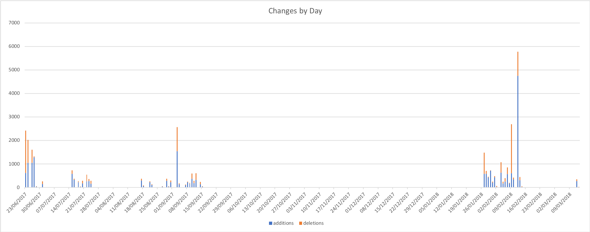
It’s worth noting that this wasn’t solid effort even on the days where I dod commit code most of the work was done on the train or late at night in hotel rooms with some crunching over weekends. I’m tempted to run a correlation between weekend commit rate and the weather – living in the UK there’s a fair chance that the weekend crunches will align with bleak rain and grey skies.
I pulled the stats for the above graph from the git log with a PowerShell script – I don’t pretend to be a PowerShell expert and I’m pretty sure it could be expressed much more concisely but if you want to get stats like this for your project you can find the script here.
Phase 1 – The Rapid Rise and Steady Decline of Optimism
Fueled by irritation with Visio and that wonderful “early project” feeling development shot out the gate. The first order of business was to copy the Fluent Mindmap codebase and strip out all the code I wouldn’t need. While doing this I remembered that the Mindmap code wasn’t that great – that project was a port of an iOS app from Xamarin into UWP and I’d used it to first learn Xamarin and then learn about UWP. You can begin to imagine… I’d also tried some experiments with a couple of patterns that didn’t really pan out. It works – but I’m not particularly proud of it (though there is a crash to do with connectors that I’ve never been able to replicate but I know users get, stack trace isn’t helpful, if you try the app and you have the issue please let me know!).
Deleting code turned out to be an ongoing theme – as I replaced mind map optimised systems with flowchart systems I would remove more code.
I found myself faced with an early decision – try and make the patterns I’d used work or ditch them and adopt what I knew to be a better approach. I decided to ditch the broken patterns and replace them with a better approach on an “as I go” basis. This worked out ok but did leave me with a slightly disjoint codebase in the middle section of the project.
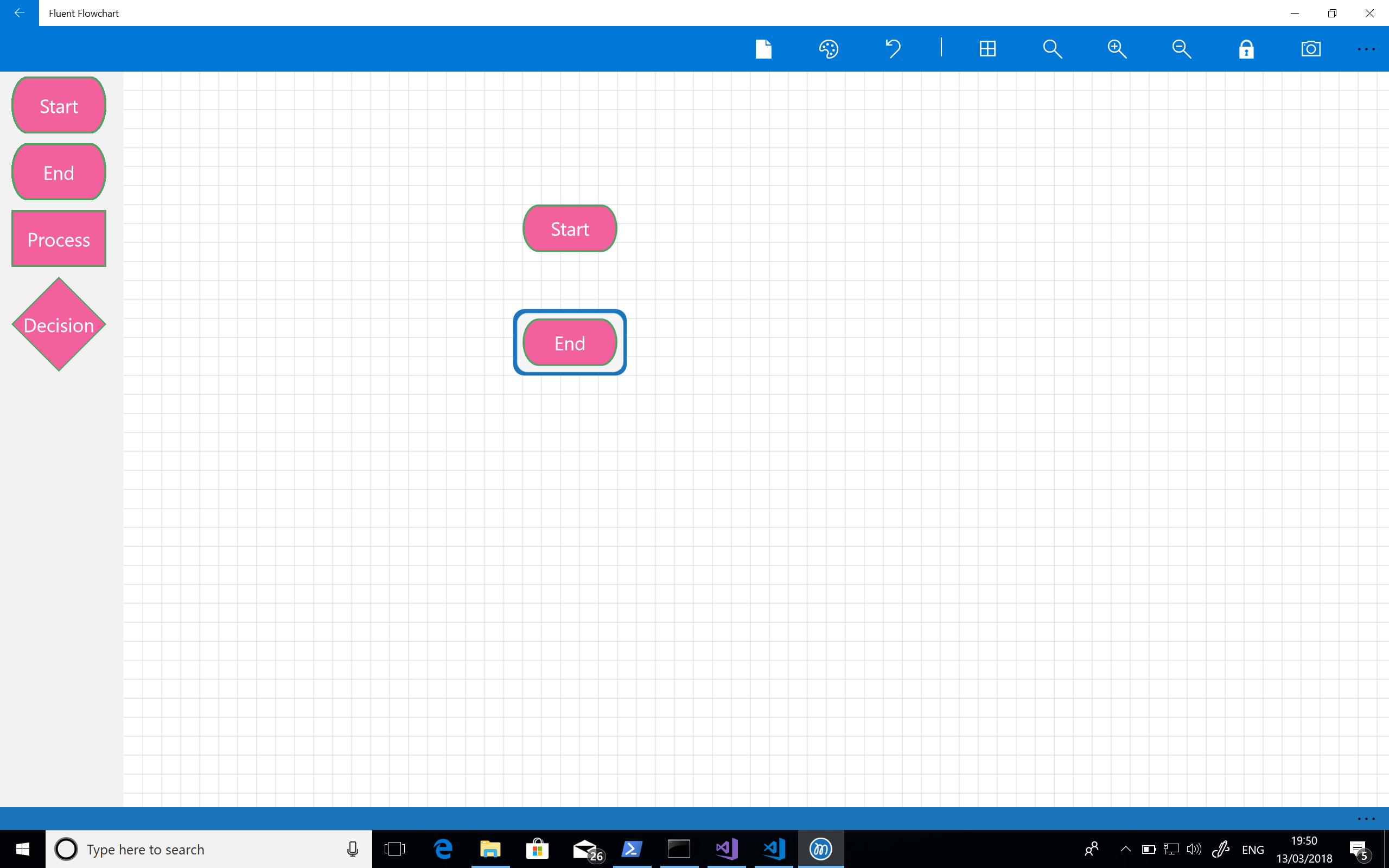
With all that done the first thing I needed to get working was a palette. My first stab at this, complete with garish colours, can be seen in the screenshot below:

The next step was to implement drag and drop from the palette. My first effort at this used the built in UWP drag and drop feature but that gave me a horrendous user experience. I spent some time trying to tweak it but it was miles away from what I wanted so I ended up implementing a custom approach that makes use of a transparent canvas overlaid over the entire editor. This gave me the fine level of control I wanted and better visuals but took a fair amount of effort. Still – it’s core to the experience and so the effort was worth it.
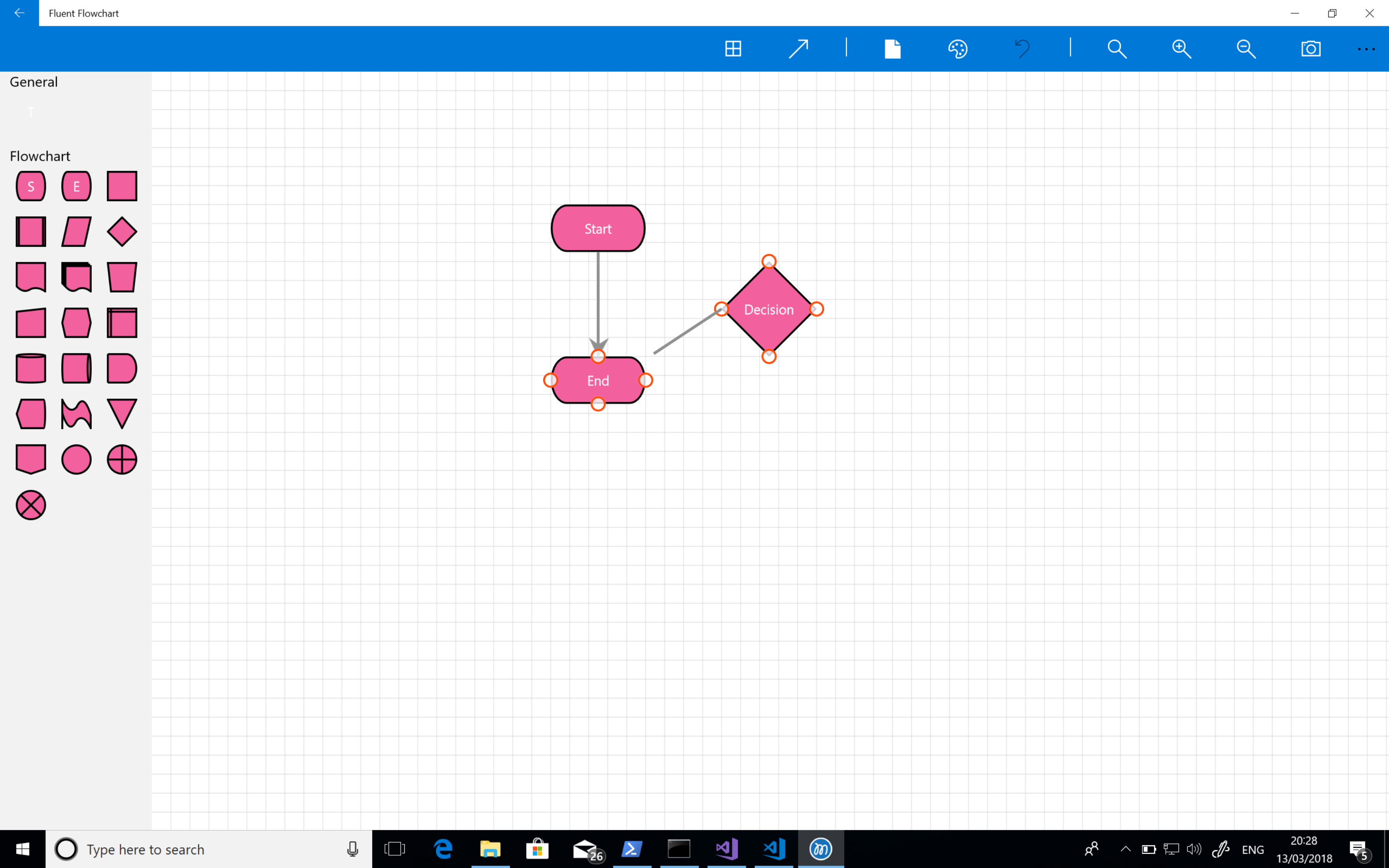
The next step was to introduce a grid for aligning elements – for many diagrams it’s really all I need to lay things out correctly. I find a grid to be predictable and intuitive as there is no second guessing about what a more “intelligent” alignment tool is going to do. At this point I was also starting to sort out the command bars with icons that made sense for the planned features but you can see I hadn’t yet implemented grab handles on shapes – the highlight is still based on that in the mind map tool. The screenshot below shows the app at this stage of its development:
At this point I could drop shapes but next I needed a means of connecting them. My initial attempt at this was really clunky – I was trying to make something touch friendly and not fiddly but this really was grim: you tap the connector button on the tool bar and then tap the connector points on the canvas (the small circles).

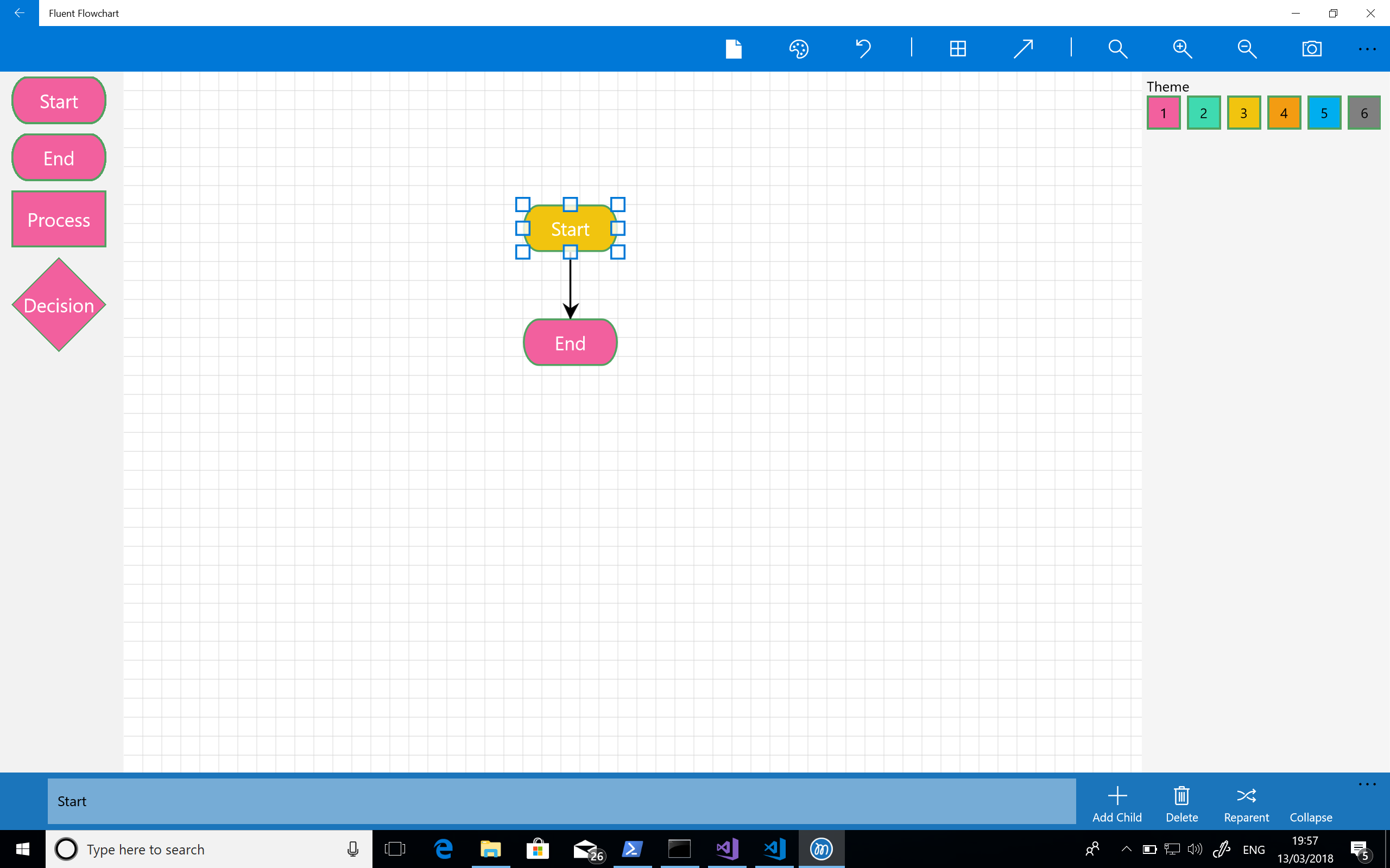
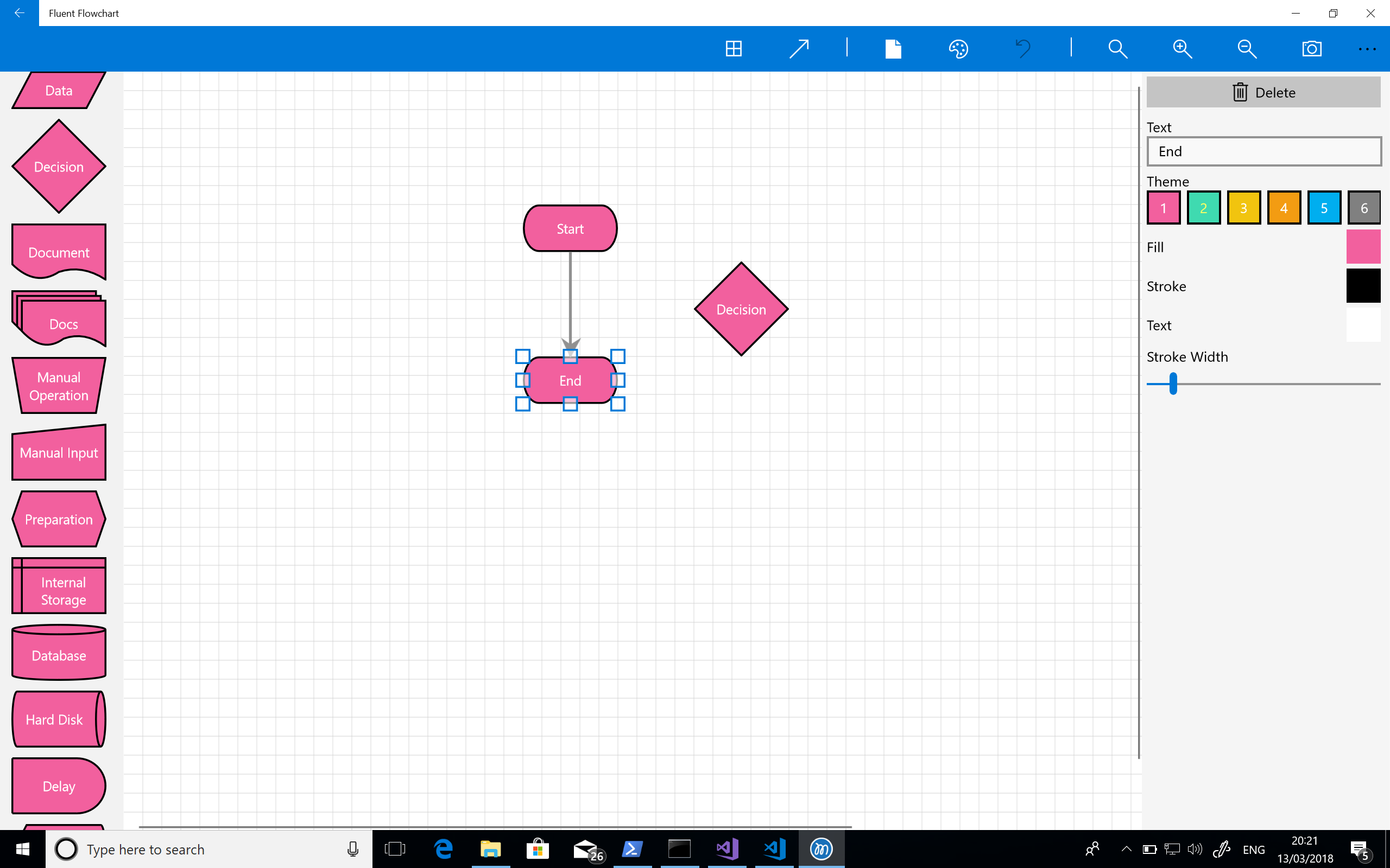
About the same time I also introduced grab handles for resizing shapes and another side bar for editing shape properties – the Mindmap tool uses a bottom app / command bar butI knew I would have too many editable properties to use for a bottom bar. Additionally although that fit into Windows 8 styling quite well I don’t really like it and it really doesn’t feel right on Windows 10. The screenshot shows this and represents development about a month after starting.
Next up was adding the ability to select connectors – this involves inflating a line into a polygon so that their is a practical hit test area. It’s just basic geometry but this proved rather taxing at 7 in the morning on the train! Eventually I got this done and also added a development flag so I can see all the hit test areas for connectors. Over the next week or two I also added some basic multi-select support and spent time expanding out the property sidebar further. For some reason, again early in the morning!, I really struggled to implement the arrow head picker in the sidebar. The implementation is actually quite simple but I really struggled to wrap my head round it.

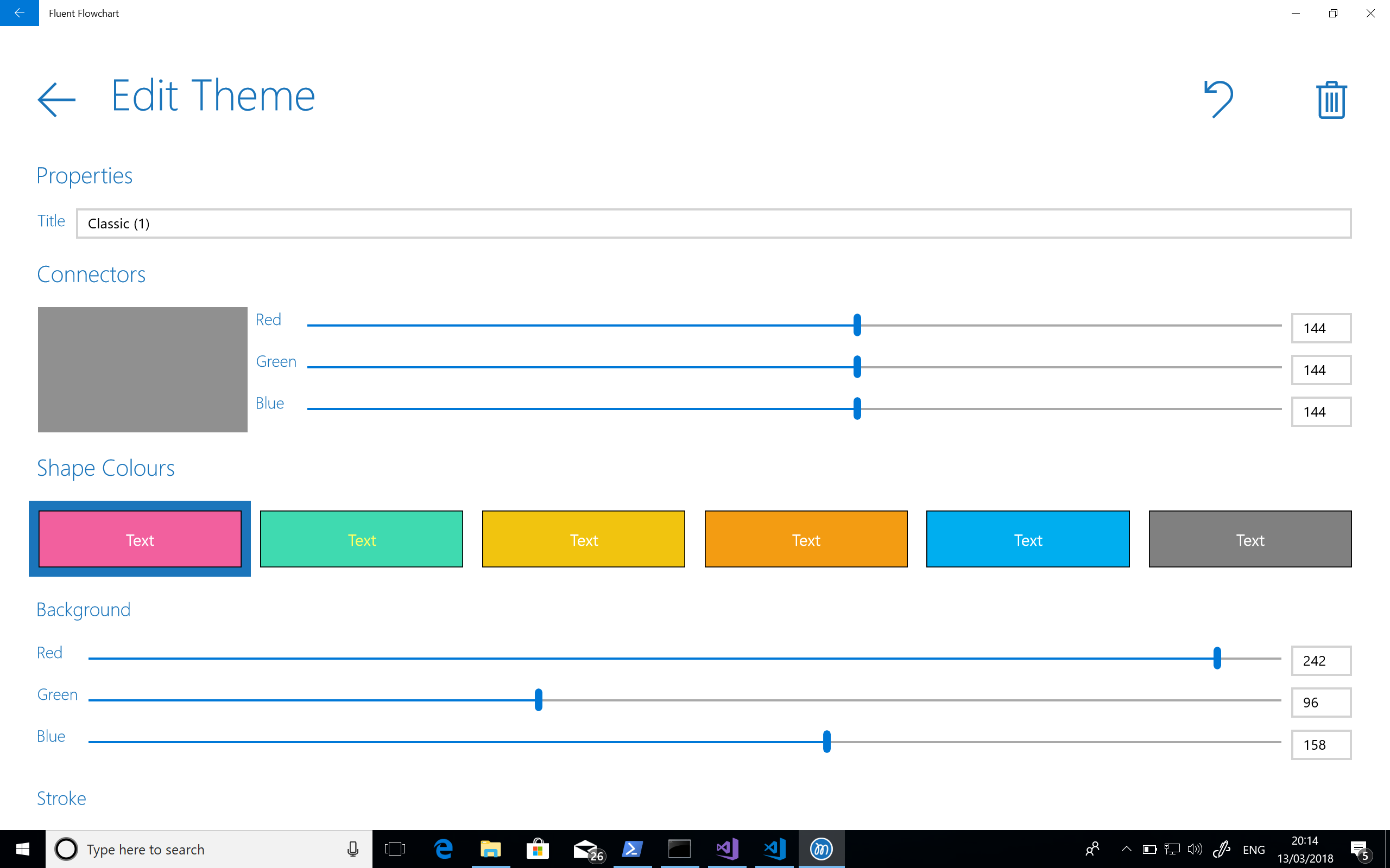
At this point there was no hiding from the realisation that completing the application was going to take quite a bit longer particularly working with such limited time as I had. And the next task I had to tackle was updating the theme editor which really did feel like laborious work and for some reason I got stuck on arrow heads again!
I knew I’d come back to the project (probably after another grapple with Visio) but I shut the lid on my laptop on the train one morning and didn’t come back to Fluent Flowchart for some time. The screenshot below shows the last thing I worked on at this stage – the theme editor.
Phase 2 – Renewed Hope and The Grind
Around 3 months later I had a bit of time on my hands during the Christmas break and had a strong urge to resume development – I really don’t like leaving things unfinished, Visio was still annoying me, and I figured that if I knuckled down and gave a final big push I could complete the app quite quickly. I started by getting myself organised: I made a list of the features and bugs I knew were outstanding in a MarkDown file (I like to have offline access) and set it up so as I completed things I would move them to a DONE section. My cheap and cheerful version of a typical SCRUM or Kanban board.
I quickly completed the theme editor I’d been struggling with though again this felt like a grind. I figured adding a richer set of flowchart shapes would be a nice set of quick wins to really get me going again and would help me work through the remaining user experience and design issues – of which there were many, including a delightfully garish set of colours and ugly palette.
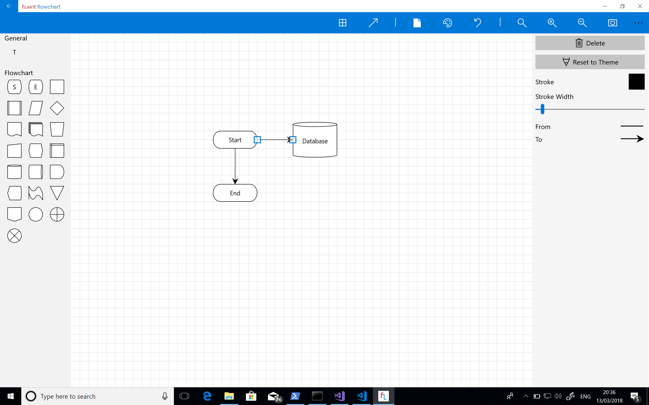
Next up was sorting out two long standing issues – the horrible oversized palette and the unpleasant way connecting shapes together functioned. As such core parts of the experience I really ought to have tackled them earlier but one of the problems with working on projects by yourself is that you get used to and blind to these things. There was still a lot left to do but this pair of tasks was the last big pieces of work I had on my list (my list, I should add, kept on growing). They took a while to implement and get right but once they were the experience was transformed:
Next there was a lot of bug fixing and small nips and tucks – screenshot feature, undo support, more connector tweaks, copy and paste and branding. At numerous points in this process I thought I was nearing completion before doing another full pass and deciding something wasn’t quite right or broken.
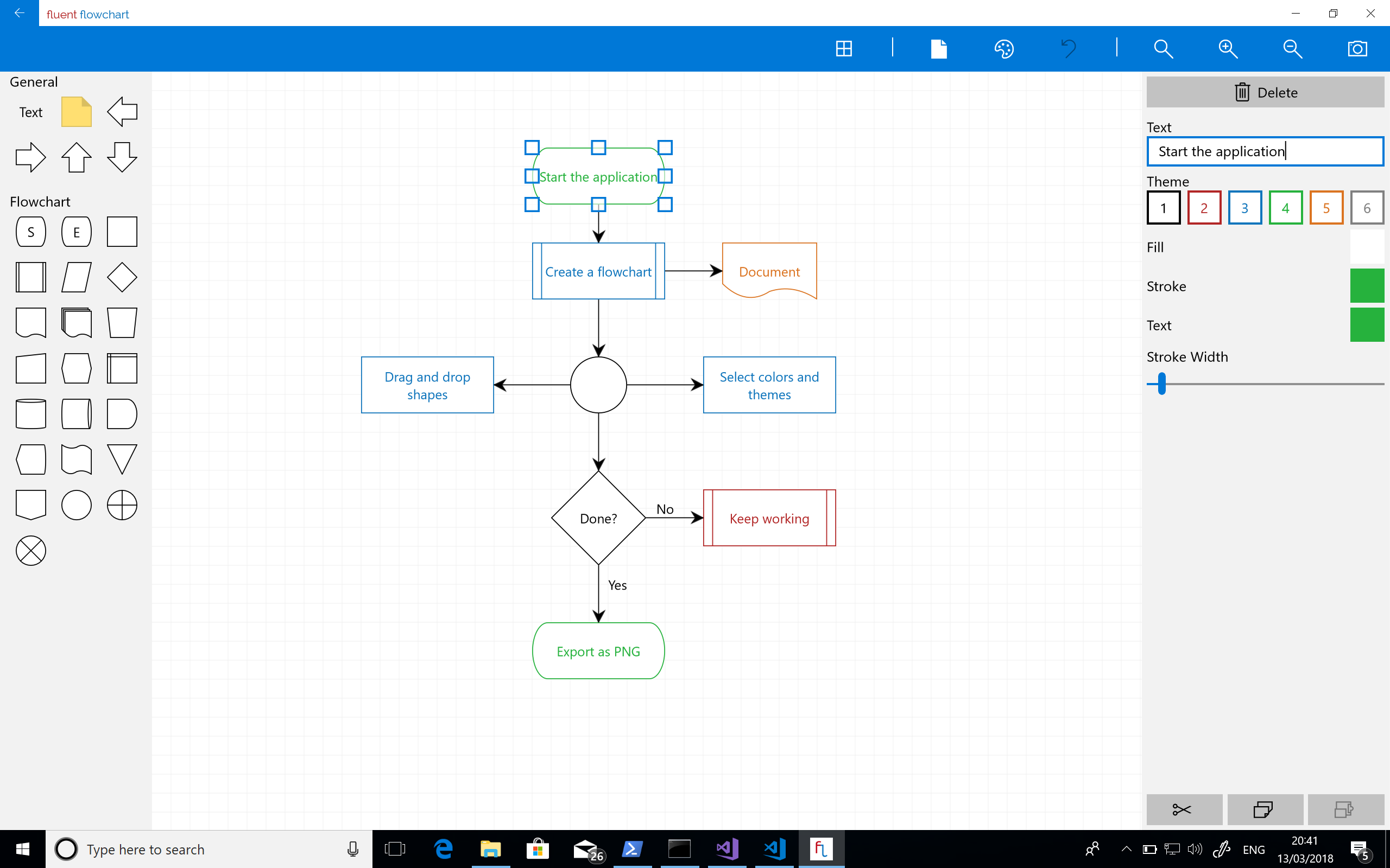
Working by myself this was definitely a bit of a grind – I got through it by setting myself a target of moving one thing, no matter how small, from the outstanding to done section of my task list. That way it always felt like I had momentum and eventually I arrived at the app shown in the screenshot below which was starting to look much cleaner and was a fairly stable app.
Another pass through and I found yet more things I wasn’t happy with so ran through more nips and tucks.
Finally. After 7 months of on and off part time development squeezed into train journeys, hotels, and weekend I had a finished app that I could ship to the store.
Leftovers
I did ship the project with a couple of features missing that I wanted:
- Right angle connectors
- Free standing connectors (by which I mean connectors that aren’t connected to shapes)
- SVG export
However at some point you have to ship and I really wanted to start getting feedback.
Observations and Lessons Learned
As with every project there were things I learned and observed throughout the process.
- Time yourself. I’ve started using Harvest to track time on all my projects whether fun side-projects, open source, or commercial. Like most developers I’m pretty poor at estimating and so occasionally create a rod for my own back – I do at least know it though sometimes this causes me to lurch into absolute pessimism as a defence mechanism. I know that too. Over the years I’ve managed to deliver the majority of my projects on time, some even early, but on occasion I’ve had to work like a demon to ensure that’s the case. I’d like to do better and I think the biggest issue I have in terms of estimating my own capacity is a lack of data. My hope is that by capturing this I’ll have a corpus of data I can use as a reference point for future work.
- Look through your commit log from time to time and go back to old builds. To pull out the stats for this blog post and some screenshots I went back from the commit log for the project. It was really interesting to look at the changes I’d made and see the steady progress that was made.
Before I did this I felt somewhat dissatisfied with how development had gone. The stop start nature made it seem like an epic scale development for something fairly modest – but looking at the project like this I can see that steady progress was made in fairly limited time and instead I now feel a sense of satisfaction with the process.
- I know this from previous projects but its always worth a reminder: user experience takes time and iteration to get right and improve and sometimes you just need to use it and feel it to know if its right. This of course takes time. If you’re working on a project that demands a high level of user experience and you don’t allow time to fail and iterate you’re just not going to get it.
- Lowball / easy tasks can be really useful for getting you in the zone and moving again after an impasse.
- Optimising something for both touch and keyboard / mouse is really hard. In the end I focused on keyboard and mouse as its the main way I interact with creative tools but I want to improve touch support.
- Even if you’re working on your own maintain a task list. Ticking things off, no matter how small, can be a real motivator and I definitely found my “one task a day” goal helped me get through the grind of bug fixing and polishing towards the end of development.
- When you finally ship your app its super rewarding!
Hope that’s interesting. If there’s anything you want to discuss I can, as ever, be reached on Twitter.
Azure Functions – Significant Improvements in HTTP Trigger Scaling
A while back I wrote about the improvements Microsoft were working on in regard to the HTTP trigger function scaling issues. The Functions team got in touch with me this week to let me know that they had an initial set of improvements rolling out to Azure.
To get an idea of how significant these improvements are I’m first going to contrast this new update to Azure Functions with my previous measurements and then re-examine Azure Functions in the wider context of the other cloud vendors. I’m specifically separating out the Azure vs Azure comparison from the Azure vs Other Cloud Vendors comparison as while the former is interesting given where Azure found itself in the last set of tests and to highlight how things have improved but isn’t really relevant in terms of a “here and now” vendor comparison.
A quick refresh on the tests – the majority of them are run with a representative typical real world mix of a small amount of compute and a small level of IO though tests are included that remove these and involve no IO and practically no computer (return a string).
Although the improvements aren’t yet enabled by default towards the end of this post I’ll highlight how you can enable these improvements for your own Function Apps.
Azure Function Improvements
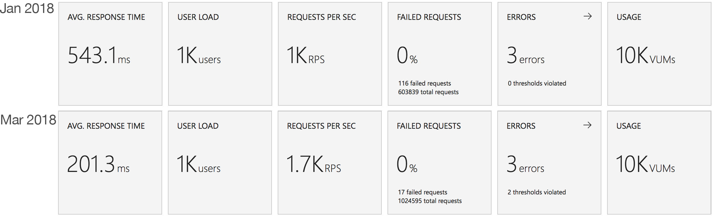
First I want to take a look at Azure Functions in isolation and see just how the new execution and scaling model differs from the one I tested in January. For consistency the tests are conducted against the exact same app I tested back in January using the same VSTS environment.
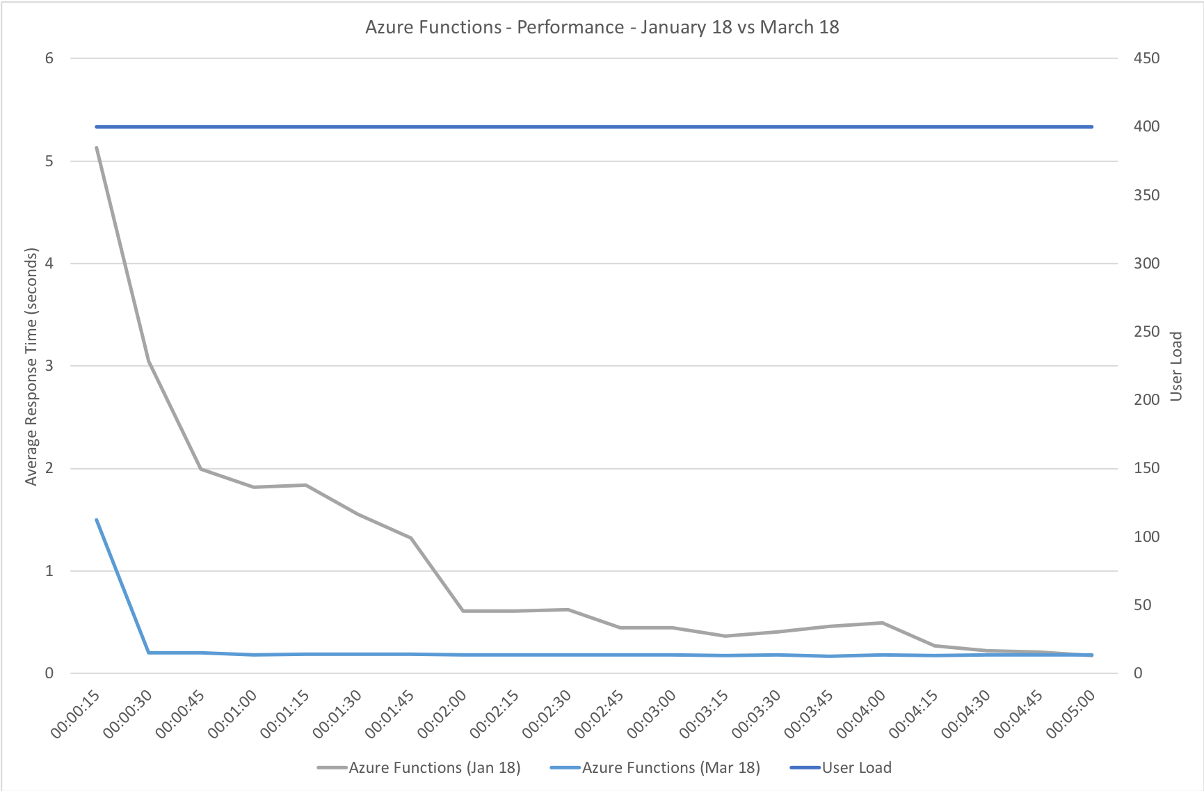
Gradual Ramp Up
This test case starts with 1 user and adds 2 users per second up to a maximum of 500 concurrent users to demonstrate a slow and steady increase in load.
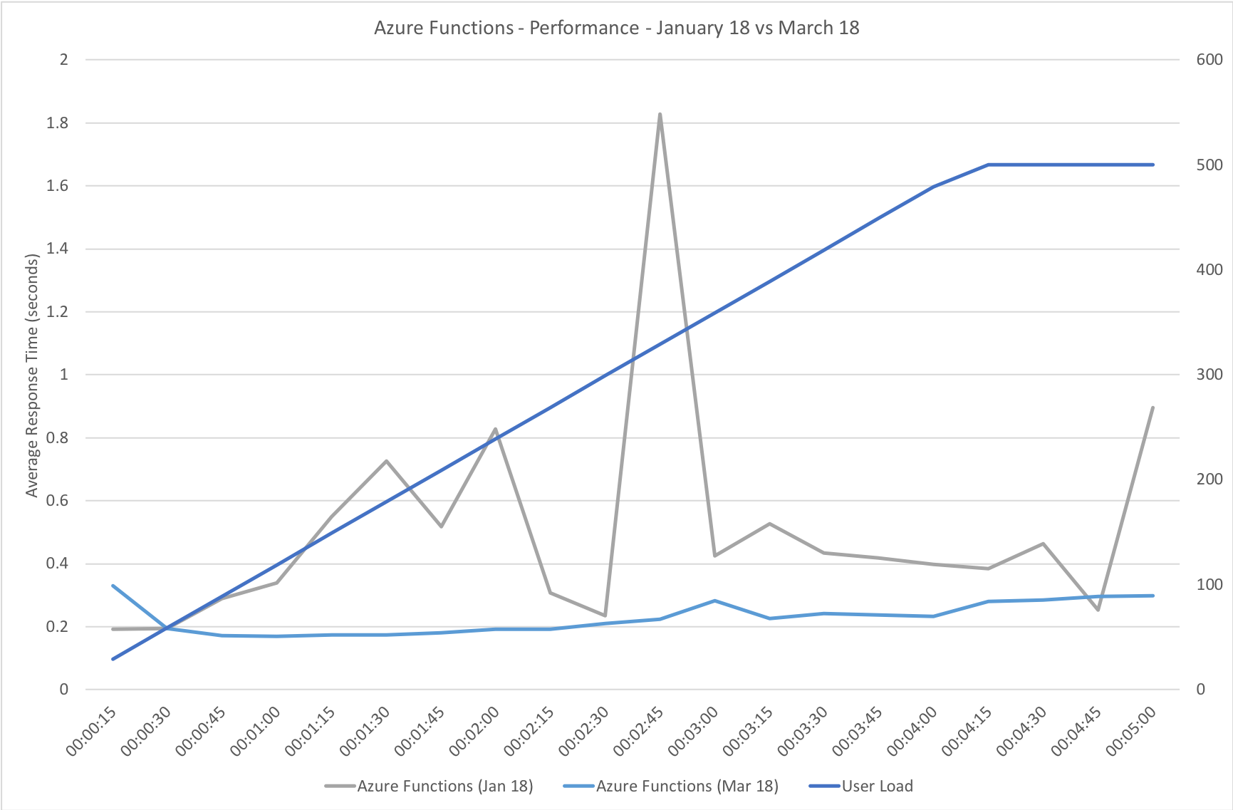
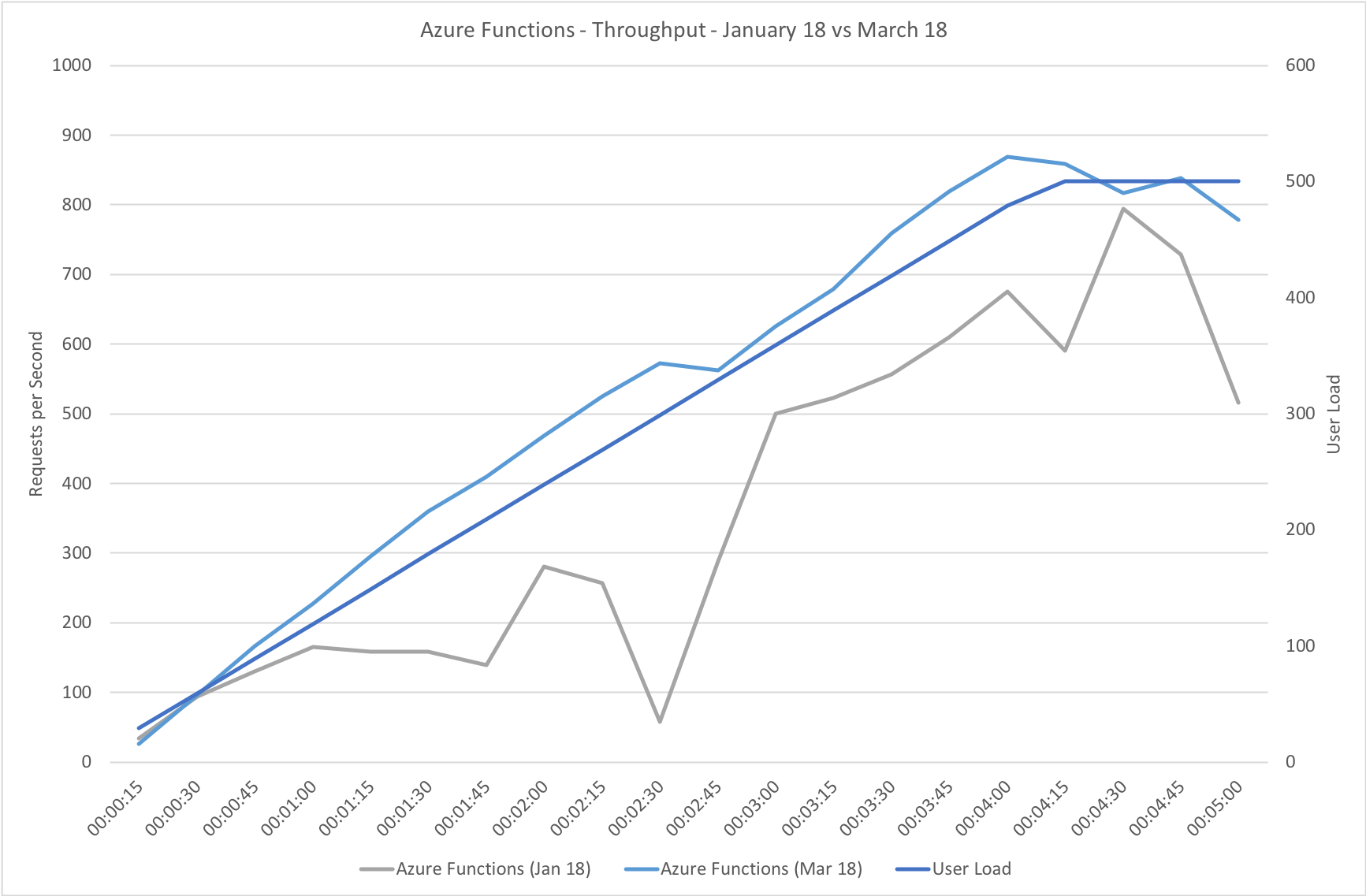
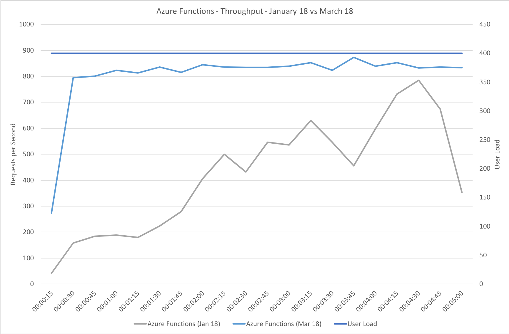
This is the least demanding of my tests but we can immediately see how much better the new Functions model performs. When I ran these tests in January the response time was very spiky and averaged out around the 0.5 second mark – the new model holds a fairly steady 0.2 seconds for the majority of the run with a slight increase at the tail and manages to process over 50% more requests.
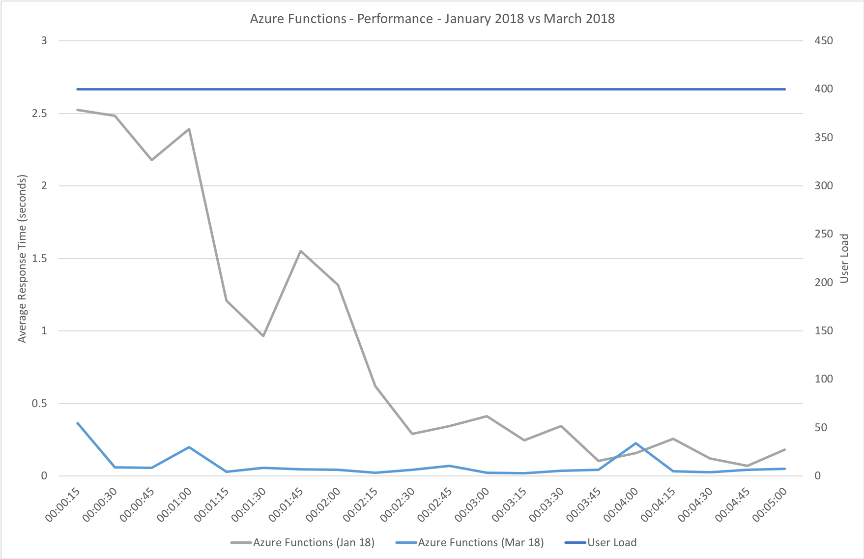
Rapid Ramp Up
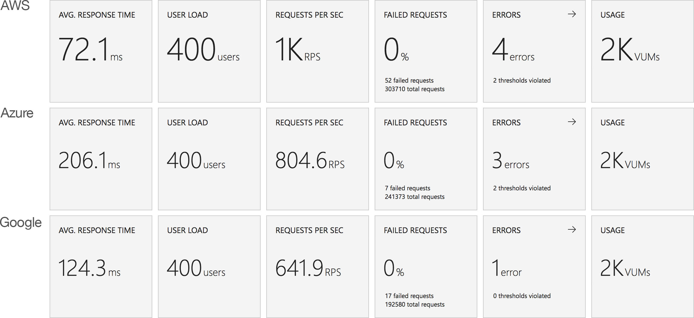
This test case starts with 10 users and adds 10 users every 2 seconds up to a maximum of 1000 concurrent users to demonstrate a more rapid increase in load and a higher peak concurrency.

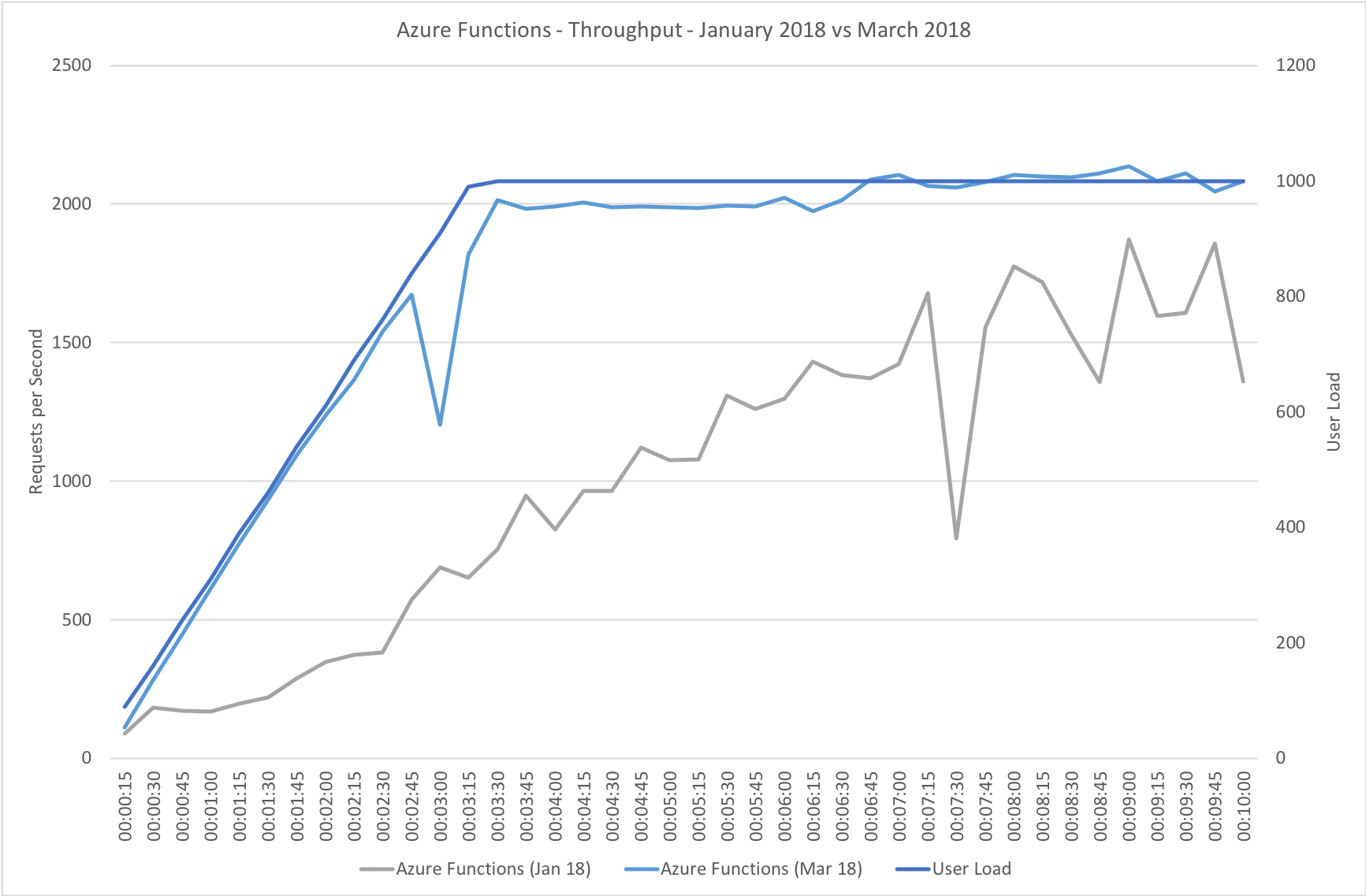
In the previous round of tests Azure Functions really struggled to keep up with this rate of growth. After a significant period of stability in user volume it eventually reached a state of being semi-acceptable but the data vividly showed a system really straining to respond and gave me serious concerns about its ability to handle traffic spikes. In contrast the new model grows very evenly with the increasing demand and, other than a slight spike early on, maintaining a steady response time throughout.
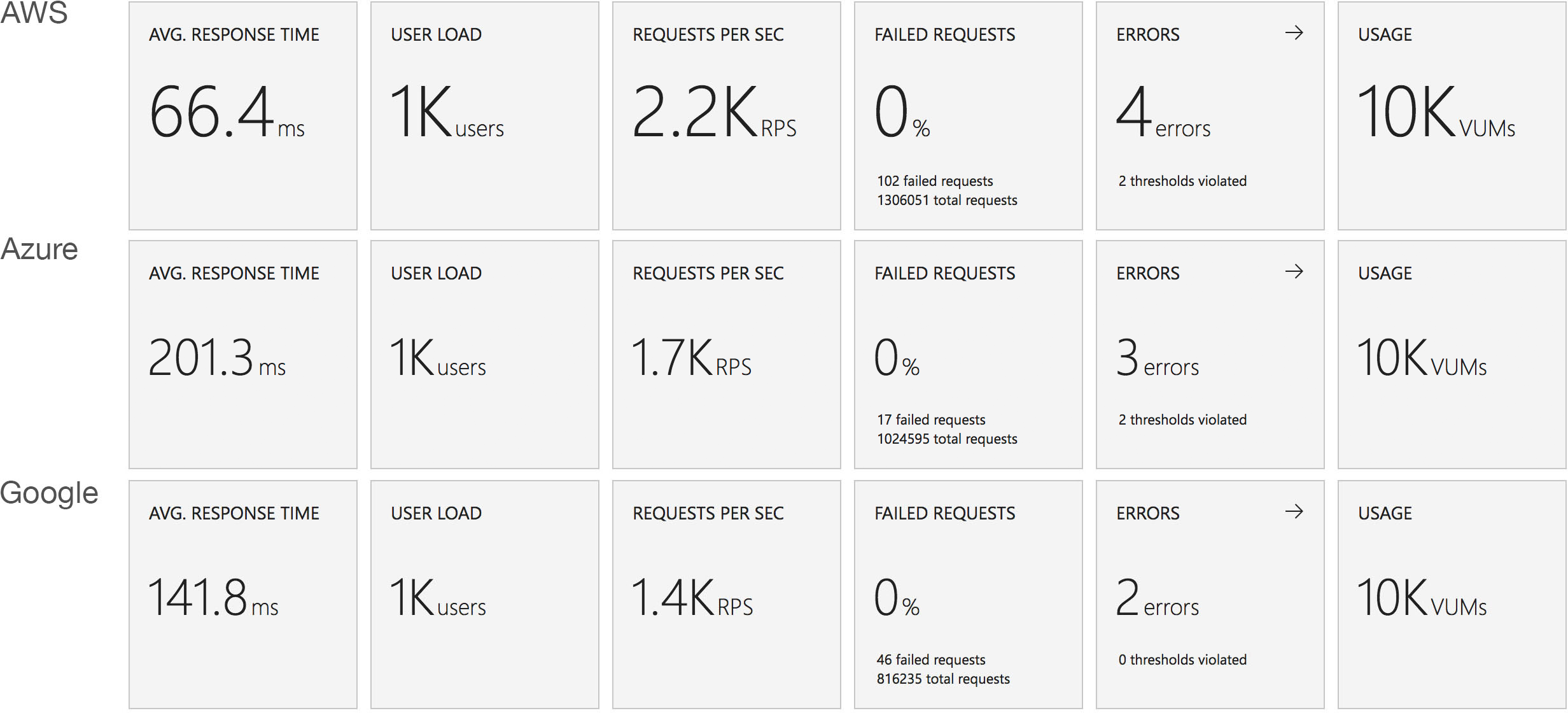
Immediate High Demand
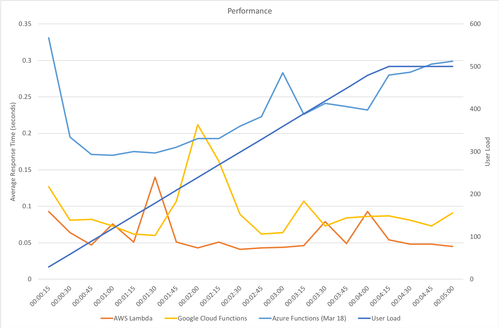
This test case starts immediately with 400 concurrent users and stays at that level of load for 5 minutes demonstrating the response to a sudden spike in demand.

Again this test highlights what a significant improvement has been made in how Azure Functions responds to demand – the new model is able to deal with the sudden influx of users immediately, whereas in January it took nearly the full execution of the test for the system to catch up with the demand.
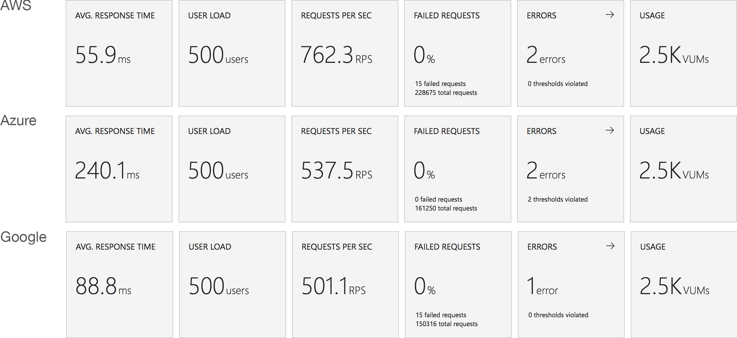
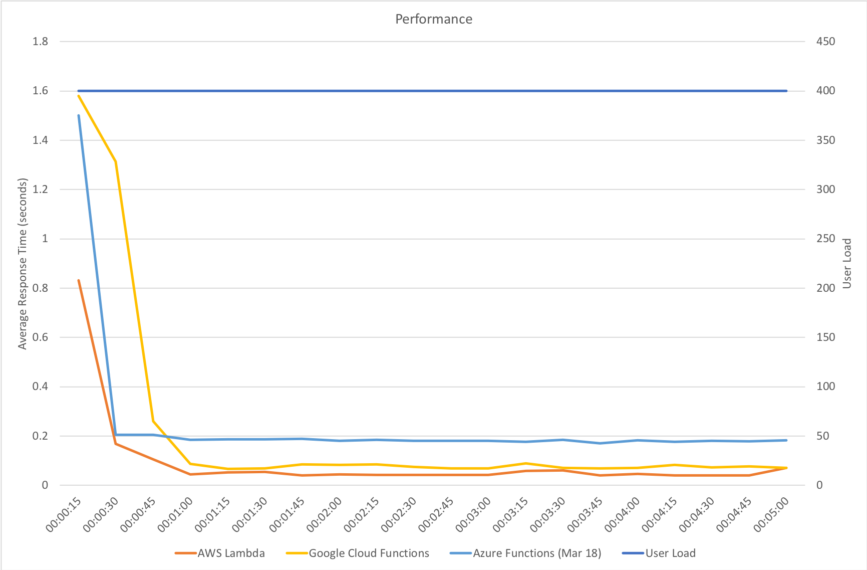
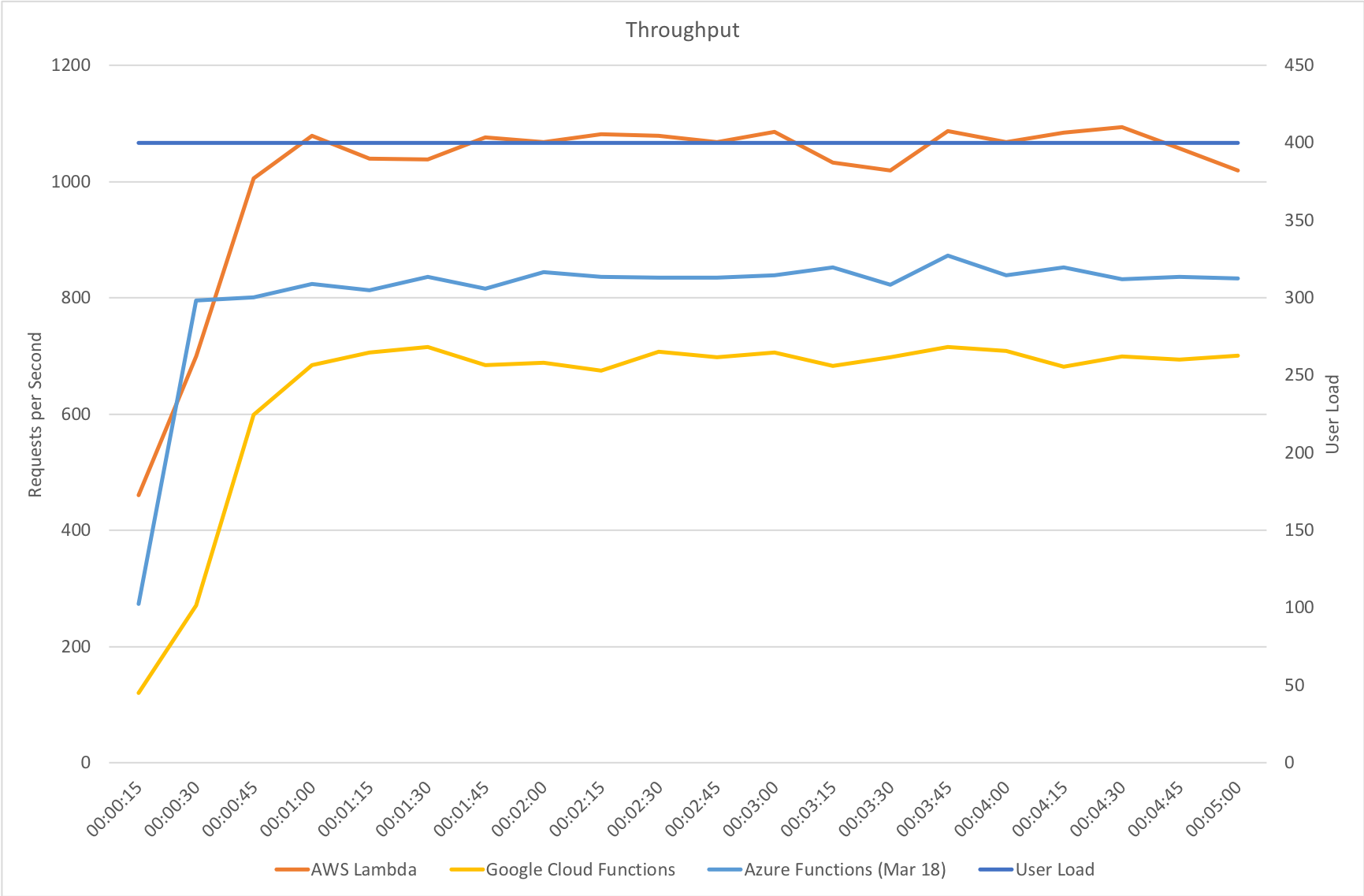
Stock Functions
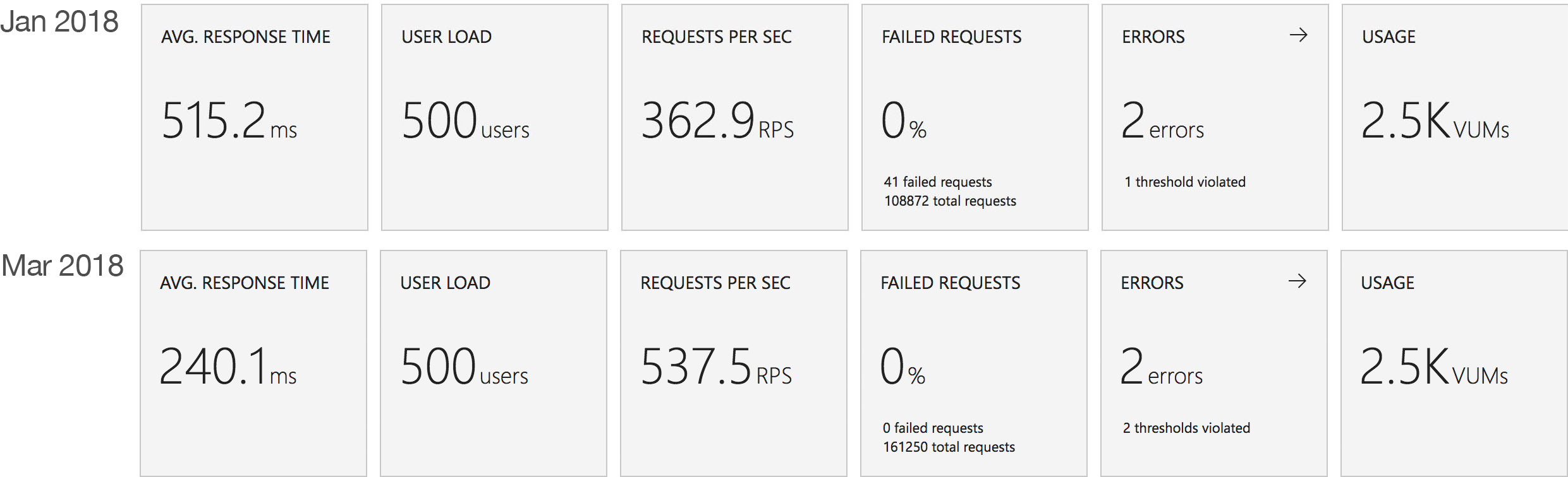
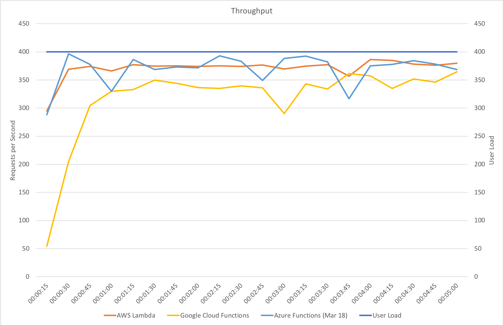
This test uses the stock “return a string” function provided by each platform (I’ve captured the code in GitHub for reference) with the immediate high demand scenario: 400 concurrent users for 5 minutes.
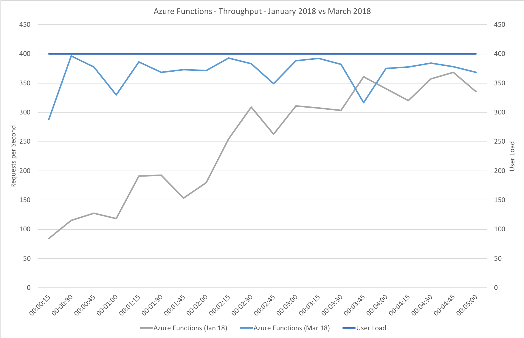
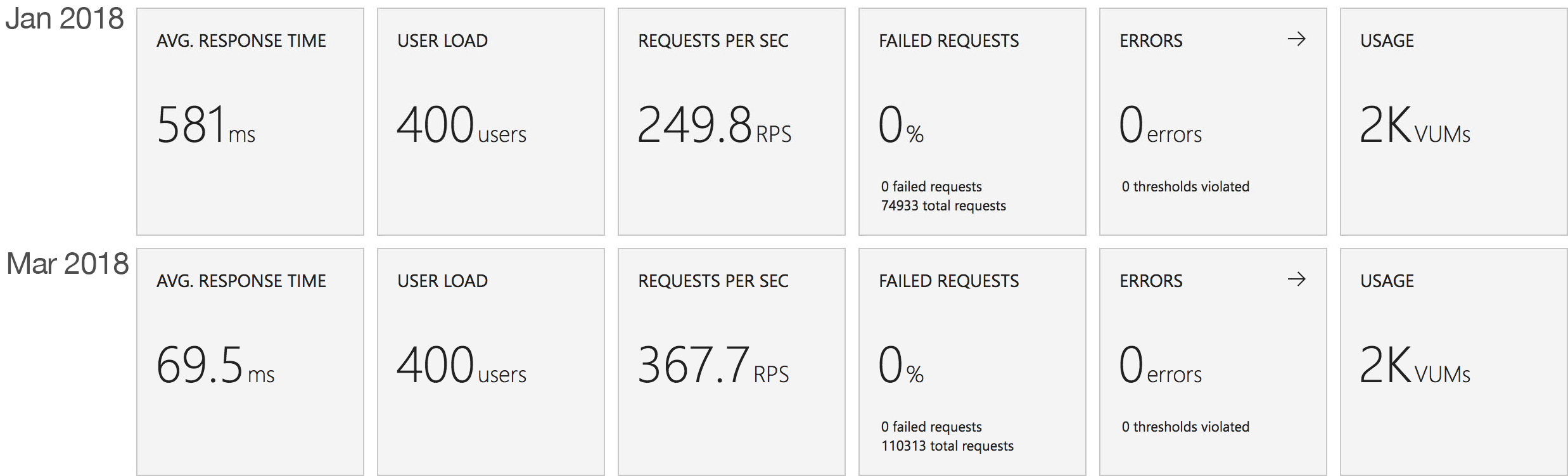
The minimalist nature of this test (return a string) very much highlights the changes made to the Azure Functions hosting model and we can see that not only is there barely any lag in growing to meet the 400 user demand but that response time has been utterly transformed. It’s, to say the least, a significant improvement over what I saw in January when even with essentially no code to execute and no IO to perform Functions suffered from horrendous performance in this test.
Percentile Performance
I was unable to obtain this data from VSTS and so resorted to running Apache Benchmarker. For this test I used settings of 100 concurrent requests for a total of 10000 requests, collected the raw data, and processed it in Excel. It should be noted that the network conditions were less predictable for these tests and I wasn’t always as geographically close to the cloud function as I was in other tests though repeated runs yielded similar patterns:
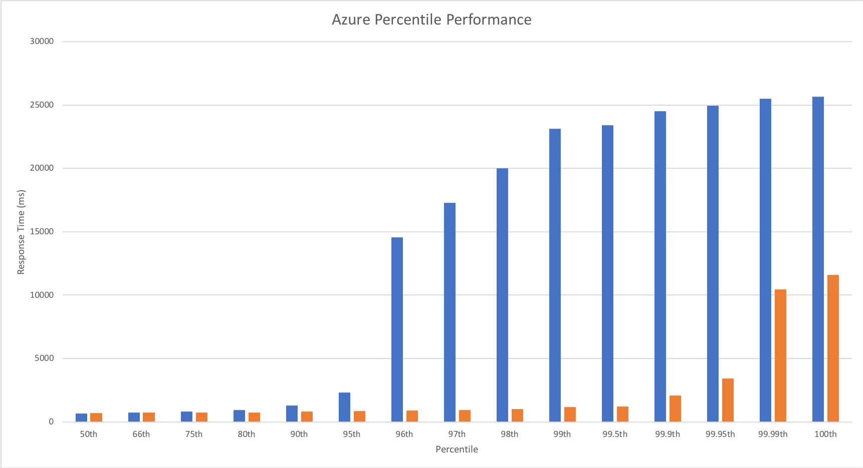
Yet again we can see the massive improvements made by the Azure Functions team – performance remains steady up until 99.9th percentile. Full credit to the team – the improvement here is so significant that I actually had to add in the fractional percentiles to uncover the fall off.
Revised Comparison With Other Vendors
We can safely say by now that this new hosting model for Azure Functions is a dramatic improvement for HTTP triggered functions – but how does it compare with the other vendors? Last time round Functions was barely at the party – this time… lets see!
Gradual Ramp Up
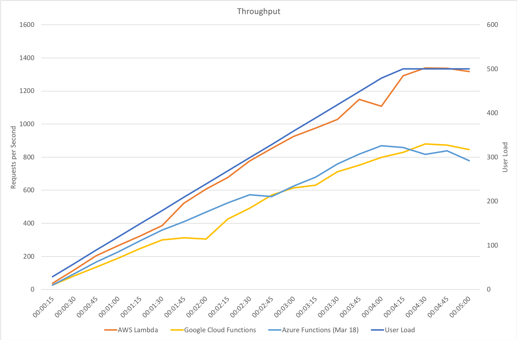
On our gradual ramp up test Azure still lags behind both AWS and Google in terms of response time but actually manages a higher throughput than Google. As demand grows Azure is also experiencing a slight deterioration in response time where the other vendors remain more constant.
Rapid Ramp Up
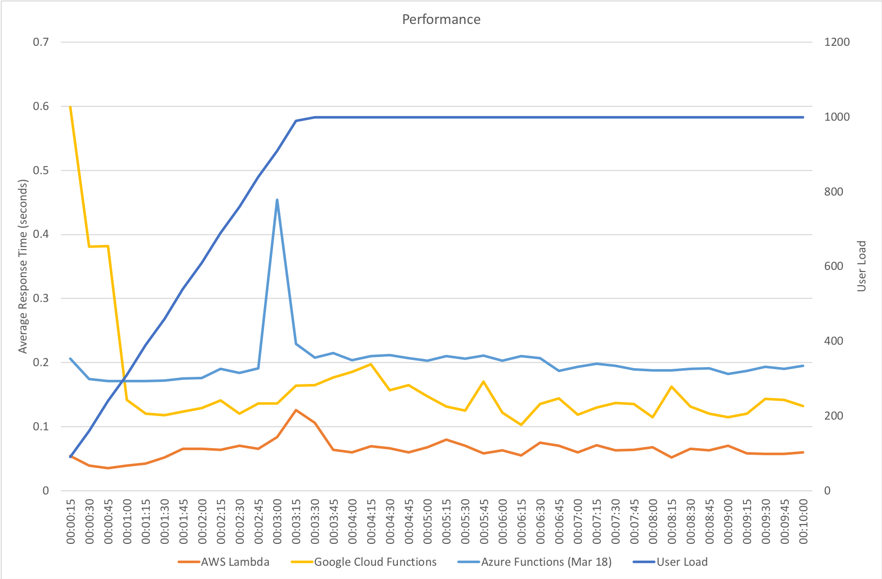
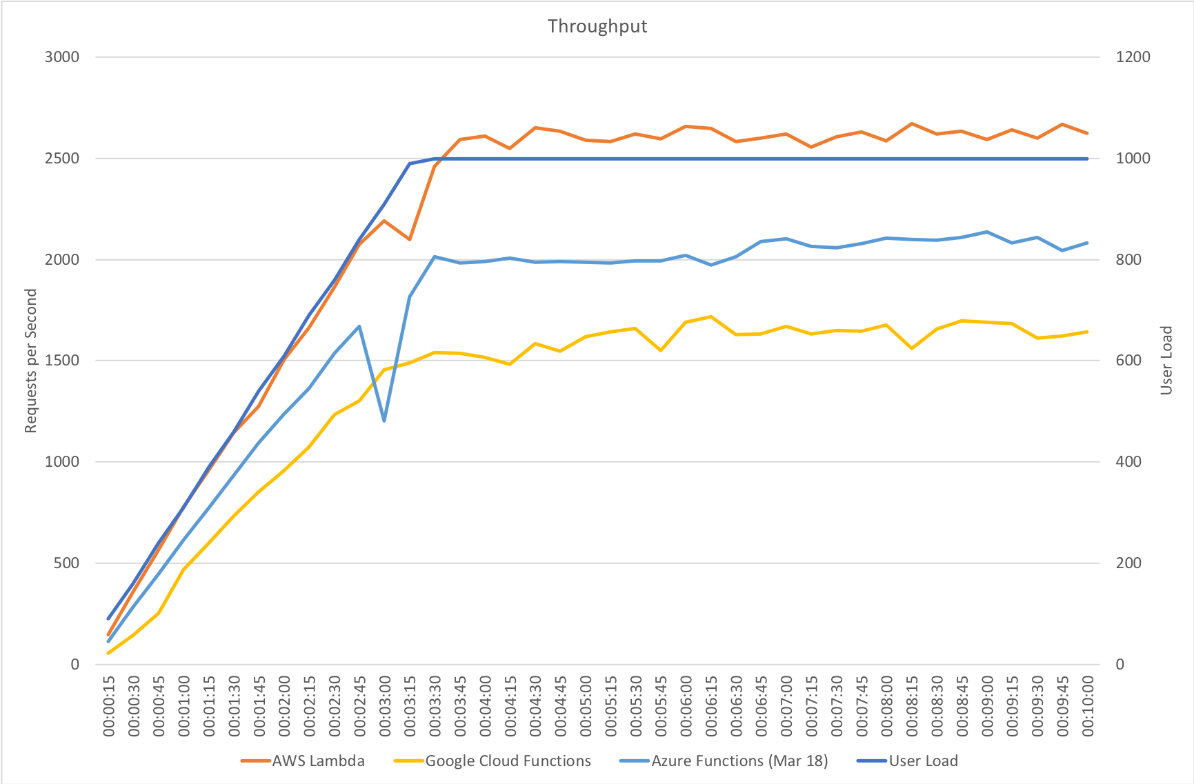
Response time and throughput results for our rapid ramp up test are not massively dissimilar to the gradual ramp up test. Azure experiences a significant fall in performance around the 3 minute mark as the number of users approaches 1000 – but as I said earlier the Functions team are working on further area at this level of scale and beyond and I would assume at this point that some form of resource reallocation is causing this that needs smoothing out.
It’s also notable that although some way behind AWS Lambda Azure manages a reasonably higher throughput that Google Cloud – in fact it’s almost half way between the two competing vendors so although response times are longer there seems to be more overall capacity which could be an important factor in any choice between those two platforms.
Immediate High Demand
Again we see very much the same pattern – AWS Lambda is the clear leader in both response time and throughput while 2nd place for response time goes to Google and 2nd place for throughput goes to Azure.
Stock Functions


Interestingly in this comparison of stock functions (returning a string and so very isolated) we can see that Azure Functions has drawn extremely close to AWS Lambda and ahead of Google Cloud which really is an impressive improvement.
This suggests that other factors are now playing a proportionally bigger factor in the scaling tests than Functions capability to scale – previously this was clearly driving the results. Additional tests would need to be run to isolate if this is the case and whether or not this is related to the IO capabilities of the Functions host or the capabilities of external dependencies.
Percentile Performance
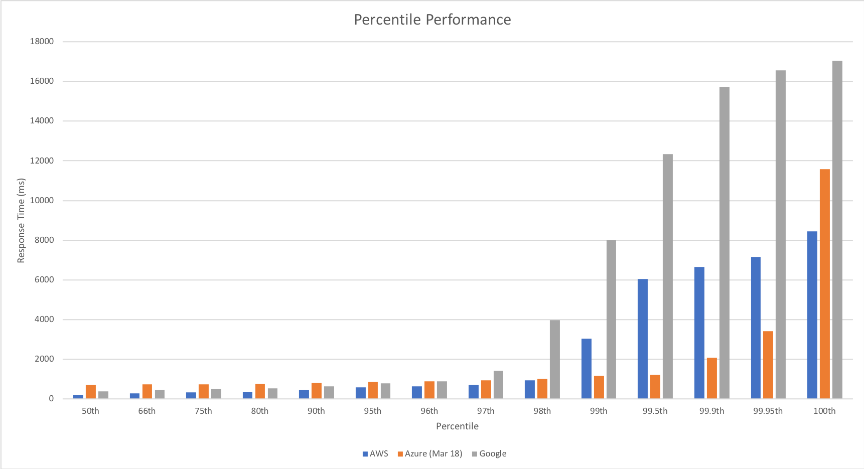
The percentile comparison shows some very interesting differences between the three platforms. At lower percentiles AWS and Google outperform Azure however as we head into the later percentiles they both deteriorate while Azure deteriorates more gradually with the exception of the worst case response time.
Across the graph Azure gives a more generally even performance suggesting that if consistent performance across a broader percentile range is more important than outright response time speed it may be a better choice for you.
Enabling The Improvements
The improvements I’ve measured and highlighted here are not yet enabled by default, but will be with the next release. In the meantime you can give them a go by adding an App Setting with the name WEBSITE_HTTPSCALEV2_ENABLED to 1.
Conclusions
In my view the Azure Functions team have done some impressive work in a fairly short space of time to transform the performance of Azure Functions triggered by HTTP requests. Previously the poor performance made them difficult to recommend except in a very limited range of scenarios but the work the team have done has really opened this up and made this a viable platform for many more scenarios. Performance is much more predictable and the system scales quickly to deal with demand – this is much more in line with what I’d hoped for from the platform.
I was sceptical about how much progress was possible without significant re-architecture but, as an Azure customer and someone who wants great experiences for developers (myself included), I’m very happy to have been wrong.
In the real world representative tests there is still a significant response time gap for HTTP triggered compute between Azure Functions and AWS Lambda however it is not clear from these tests alone if this is related to Functions or other Azure components. Time allowing I will investigate this further.
Finally my thanks to the @azurefunctions team, @jeffhollan and @davidebbo both for their work on improving Azure Functions but also for the ongoing dialogue we’ve had around serverless on Azure – it’s great to see a team so focused on developer experience and transparent about the platform.
If you want to discuss my findings or tech in general then I can be found on Twitter: @azuretrenches.

Recent Comments